Edit Content

FAT FROG

Branding & Design Studio
Fatfrog Logo Gif

Fat Frog Branding & Design Studio, We specialize in crafting unique, high-quality packaging solutions that not only Safeguard your products but also enhance your brand’s identity.

One More Time

Brand Identity Design, Brand Guidelines, Brand Strategy, Communication Creative Design, Brand Naming, Packaging Design.


One More Time – Where Elegance Meets Indulgence.

At One More Time, we’re here to redefine the food and beverage experience with bold flavors, vibrant energy, and a refreshing perspective. Every creation  whether it’s a dish or a drink  is crafted to awaken the senses and spark connection. We believe in celebrating freedom, belonging, and pure joy through taste, creating moments that feel alive, inclusive, and unforgettable with every bite and sip.

Brand Identity Design

Direction

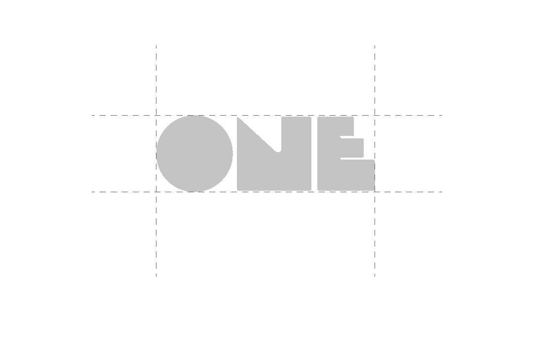
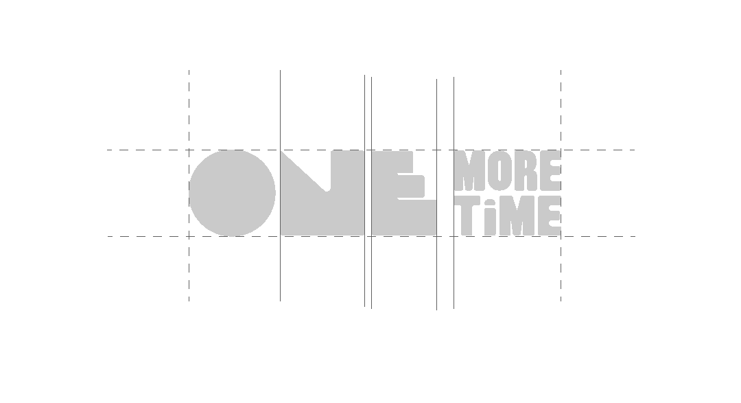
We use abstract, bold typefaces to create a strong and disruptive visual presence. Typography is applied in stretched, overlapped, or broken styles to establish a raw and modern character. Layouts are designed on grids with a structured approach inspired by industrial labels and tickets. The system extends into vertical, sub-mark, and Hindi variations, keeping the identity adaptable while maintaining a consistent.

Artboard 1 e1760511770175
Artboard 4 e1760511998783

Concept

The brand identity is centered on a bold typo graphic approach, where “ONE” is highlighted in a large, prominent style to immediately grab attention and make the brand feel confident and memorable. In contrast, “MORE TIME” is shown in a smaller size to create rhythm and balance, adding a playful and approachable quality. The constant presence of “KOMBUCHA” serves as the grounding element, tying the identity together across all formats

Variation

The One More Time identity system incorporates a vertical variation to support diverse applications. In this format, “ONE” retains primary emphasis, placed prominently above “MORE TIME.” This configuration is especially effective in tall or narrow spaces, ensuring the brand maintains visibility and impact while preserving its typographic hierarchy.

Artboard 5 e1760512294333

Main Identity

The main identity of One More Time is rooted in the harmony between nature, craft, and emotion. It represents a modern, refreshing, and soulful take on fermented tea where tradition meets contemporary taste. Every element of the brand’s identity, from its visual language to its tone of voice, reflects balance, rejuvenation, and sophistication.

At its core, One More Time embodies the art of slowing down and savoring life  celebrating the beauty of repetition and the comfort of familiarity, made new again. The brand’s design system blends organic textures, warm tones, and fluid shapes that echo the natural process of fermentation and the flow of time.

More than a beverage, One More Time stands as a symbol of mindful living, inviting people to reconnect with themselves, their surroundings, and the simple joy of being present one sip, one moment, one more time.

Artboard 4 e1760511998783
Artboard 8 e1760513225785
Artboard 6 e1760513250659

Strategy Statement

At One More Time, our strategy is to redefine how people experience fermented tea transforming it from a niche beverage into a lifestyle choice that celebrates freedom, flavor, and connection. We aim to lead the new wave of mindful refreshment by combining authentic fermentation, vibrant taste innovation, and bold brand storytelling.

Through creative collaborations, sustainable sourcing, and inclusive community experiences, we’ll position One More Time as the go-to brand for those seeking energy with authenticity a drink that’s as alive as the people who enjoy it. Our approach blends modern design, cultural relevance, and transparency to build a loyal audience that doesn’t just sip our tea they live our ethos: refresh, revive, repeat — One More Time.

Key Challenge

The biggest challenge for One More Time lies in educating and converting consumers in a market still unfamiliar with fermented tea as a mainstream beverage choice. While global wellness trends are rising, awareness and understanding of the benefits and flavor profile of fermented tea remain limited — especially in markets dominated by traditional soft drinks, energy beverages, and ready-to-drink teas.

Building trust and curiosity requires breaking through consumer hesitation around fermentation, taste expectations, and price perception. Additionally, standing out in an increasingly crowded “healthy beverage” category means we must create a strong emotional connection beyond functional benefits — positioning One More Time as a lifestyle movement, not just another drink.

Brand Naming

The name One More Time captures the spirit of renewal, connection, and timeless enjoyment. It reflects the brand’s philosophy that every sip is an invitation to pause, refresh, and experience life’s moments all over again, with greater appreciation.

Just like fermentation transforms simple tea into something richer and more alive, One More Time symbolizes transformation of mood, energy, and perspective. The name resonates with a sense of nostalgia and curiosity, encouraging people to come back, to relive, and to savor the experience once more.

It’s more than a name it’s a feeling. A reminder that every moment, and every cup, deserves to be enjoyed one more time.

Backwards Beer Cap Mockup 1 scaled
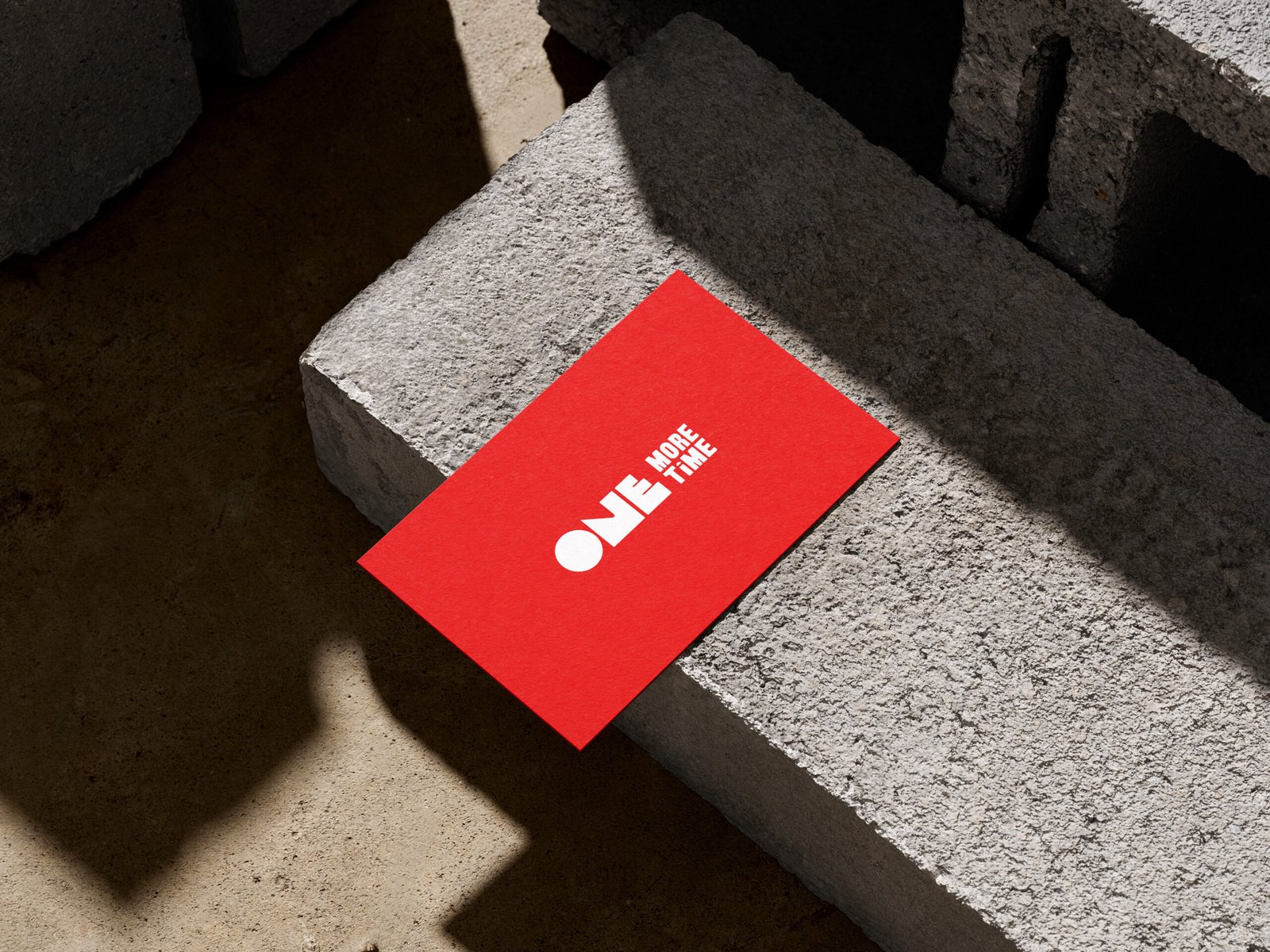
Business Cards On Concrete Mockup 2 scaled

Creative Direction

The creative direction of One More Time draws inspiration from the beauty of transformation the way simple ingredients evolve through time to create something richer, deeper, and more alive. This philosophy shapes every visual and sensory element of the brand, from color and texture to tone and storytelling.

Rooted in authenticity, balance, and emotion, the creative expression embraces a modern yet organic aesthetic. Earthy hues, soft gradients, and fluid shapes mirror the natural fermentation process, while refined typography and clean layouts convey sophistication and calm.

Each creative choice whether in packaging, photography, or digital presence is designed to evoke warmth, connection, and a sense of renewal. One More Time isn’t just seen; it’s felt. It invites people into an experience that’s vibrant yet grounded, familiar yet new a refreshing reminder to savor life’s moments, again and again.

One More Time

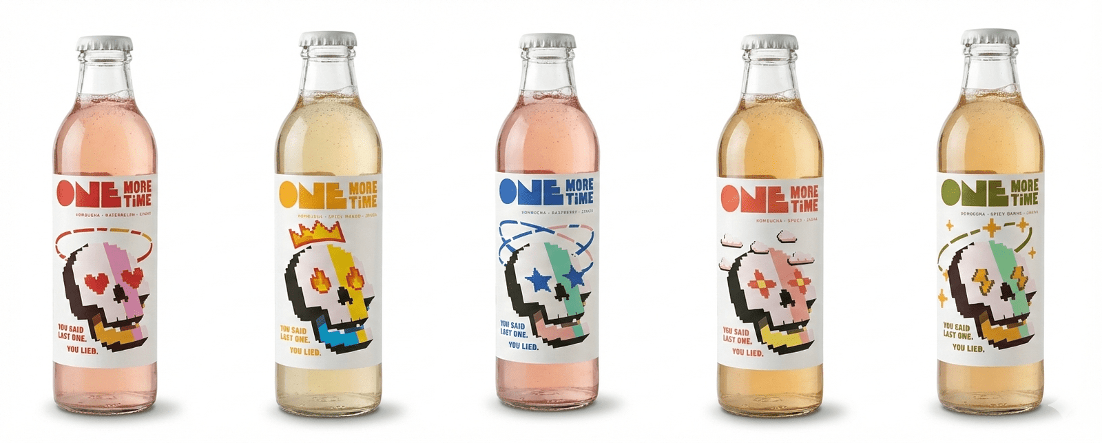
Packaging Design

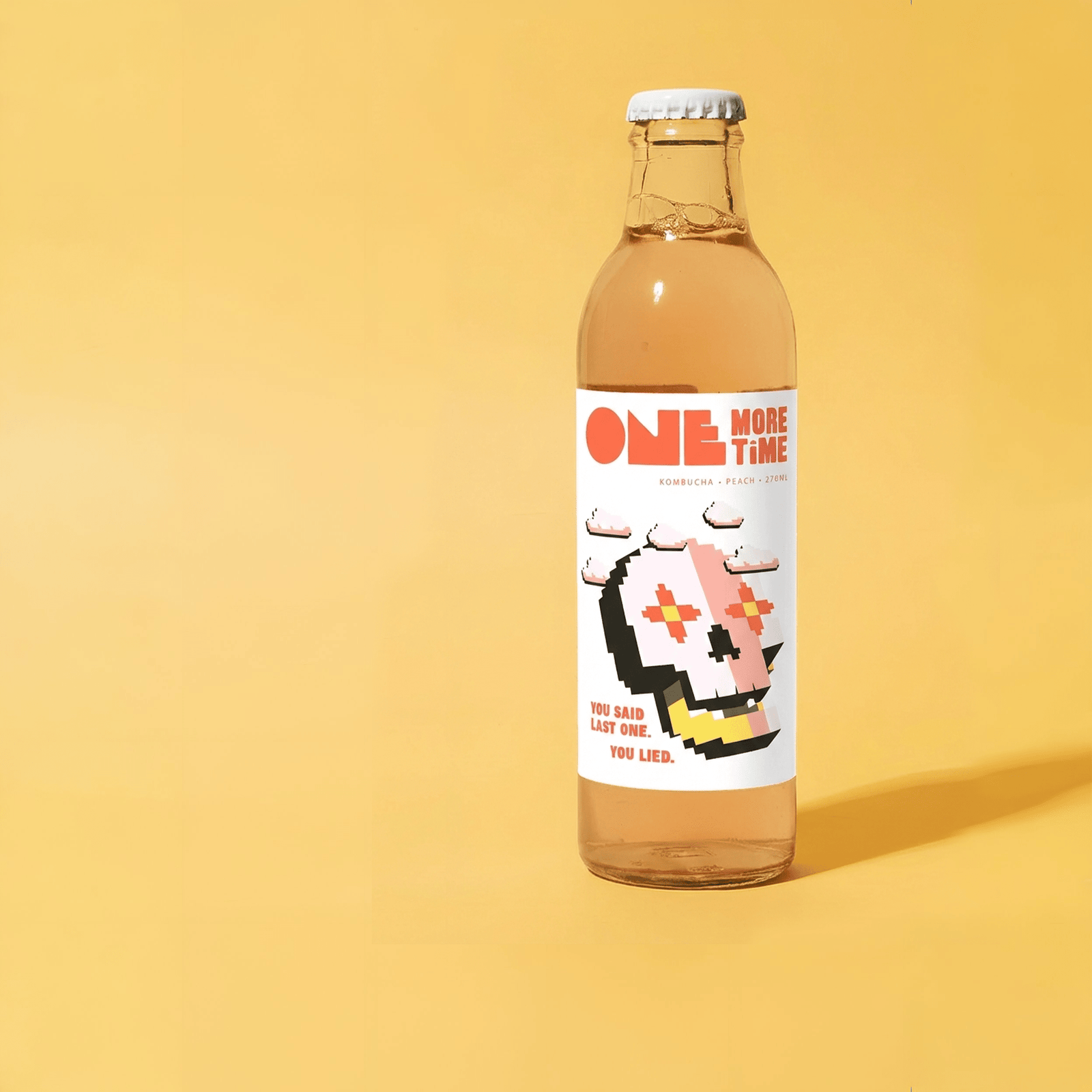
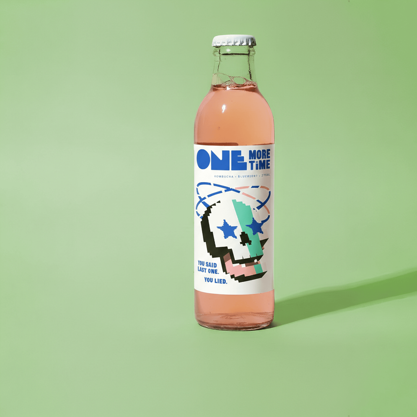
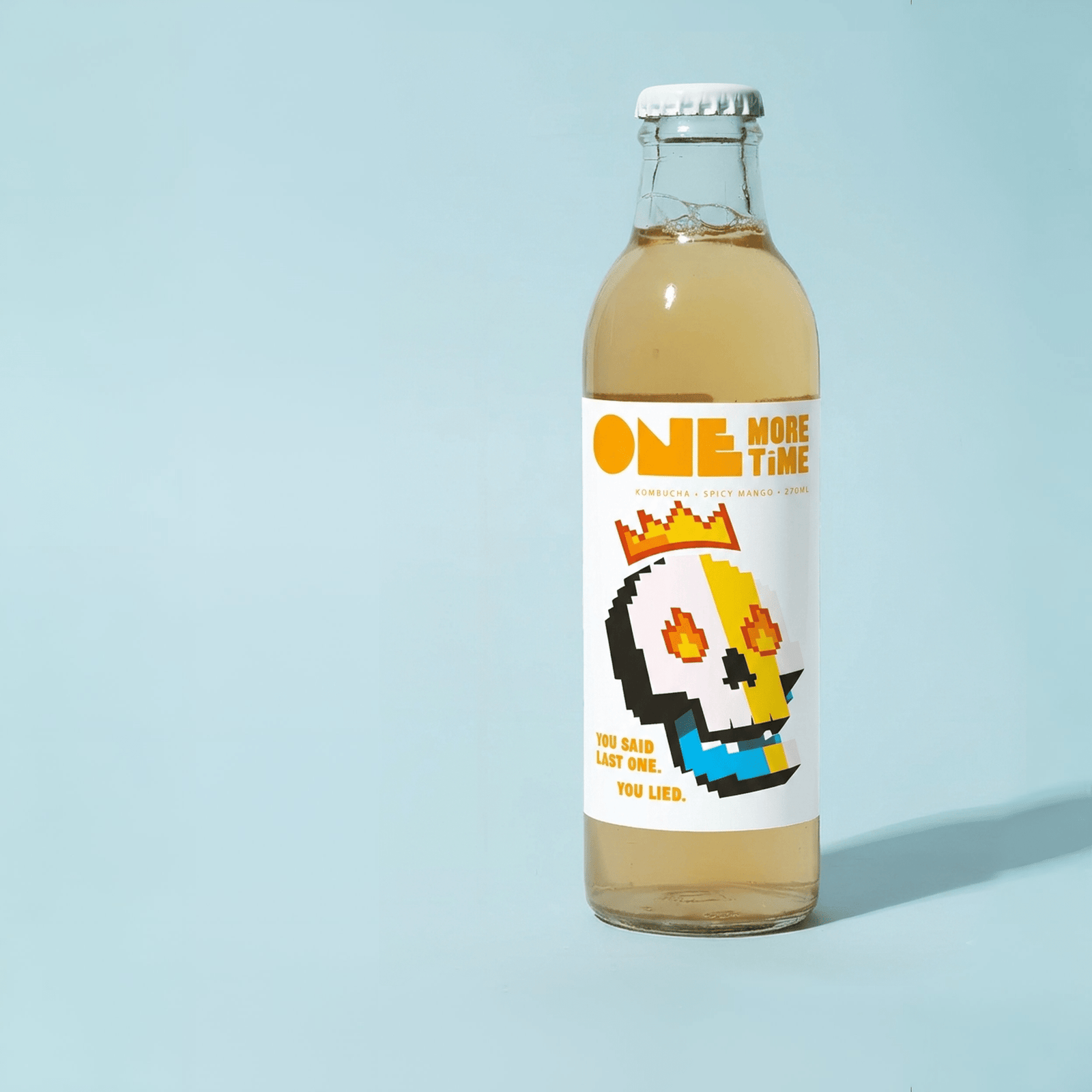
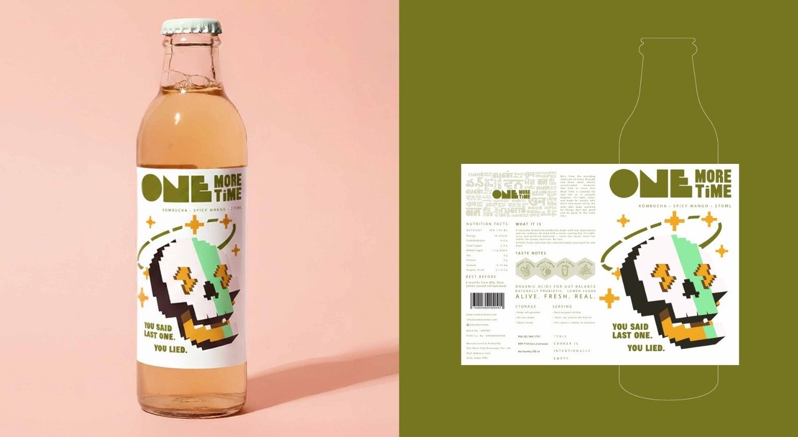
The packaging design for One More Time embodies the brand’s spirit  bold, youthful, and alive with energy. Every element is crafted to reflect the raw authenticity of fermentation and the modern attitude of those who choose to live life on repeat, fearlessly and consciously. Our design language fuses vibrant color gradients, clean typography, and fluid forms that echo the natural movement of fermentation symbolizing transformation and flow. Each bottle tells a story of freshness and rebellion, inviting the consumer to take a sip, feel the vibe, and go One More Time.

Artboard 1 1 scaled
Untitled design 2

Color Palette

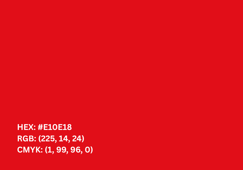
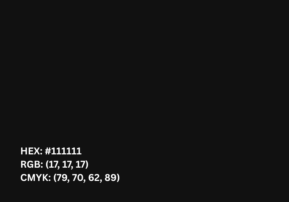
The signature brand colour. Strong,bold, and energetic, used to create instant recognition and impact.

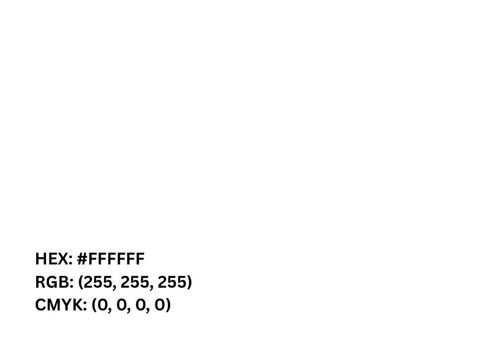
Provides balance and space. Keeps layouts clean and ensures text remains highly legible.

A supporting colour. Adds structure,sophistication, and is mainly used fordescriptors and secondary text.

1
2
3

Typography Usage

Typography plays a central role in expressing the bold, modern personality of One More Time. It captures the rhythm, movement, and energy that define our brand turning every word into an experience.Typography is treated not just as text, but as a visual rhythm echoing the pulse of music, movement, and fermentation. Whether it’s on a bottle label, website banner, or social post, every letter feels alive, inviting the viewer to join the beat and go One More Time.

Primary Typeface

  • Used for expressive and bold elements in the identity.
  • Represents the brand’s energy and personality.
  • Works best in headlines, logo lockups, and impactful statements.

Juzif
Black

ABCDEFGHIJKLM
NOPQRSTUVWXYZ 1234567890!@
#$%^&*()

Secondary Typeface

  • Bahnschrift – For all information and supporting text (similar
    role toblack in colours). Keepscommunication clear and consistent.

Bahnschrift

ABCDEFGHIJKLM
NOPQRSTUVWXYZ 1234567890!@
#�%^&*()

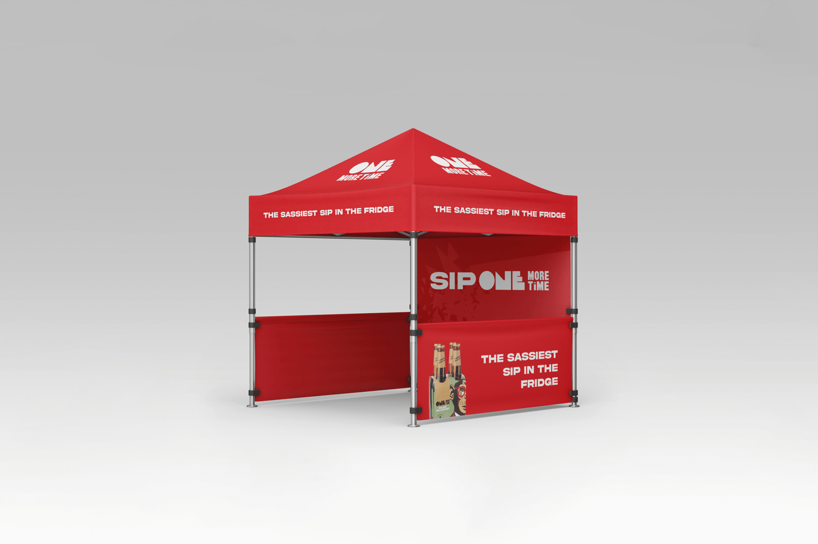
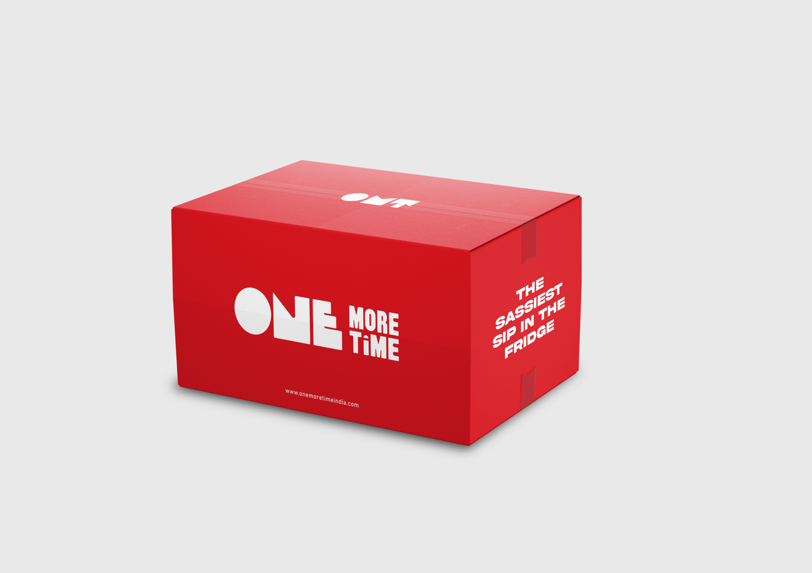
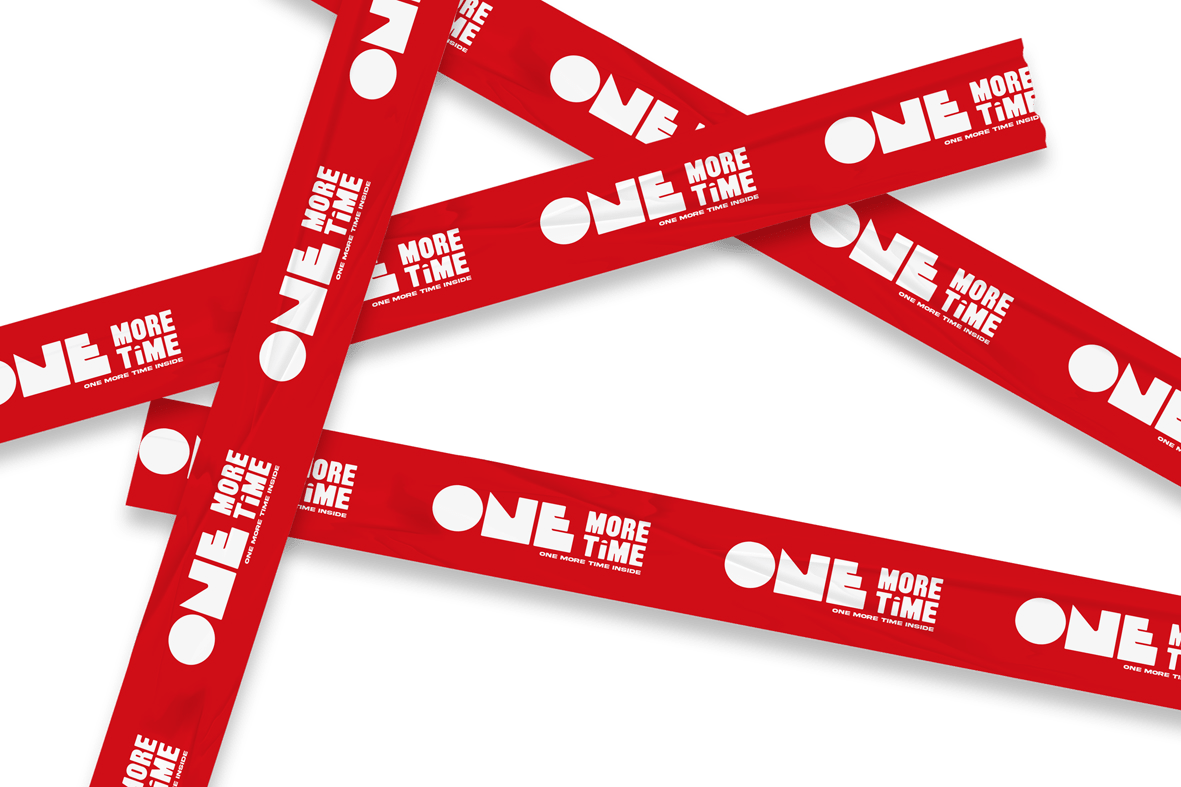
Our Mockups

One More Time

Communication Creative

Our communication strategy for One More Time is built around energy, authenticity, and culture  speaking to a generation that values experience over perfection. Every piece of creative work will echo our core belief: life is better when lived on repeat refreshed, revived, and ready to go One More Time.

We communicate not as a brand selling a drink, but as a friend starting a movement one that celebrates real moments, creative hustle, late nights, and conscious choices. Our tone is bold, conversational, and unapologetically real  blending street culture, wellness, and lifestyle in a way that feels fresh and fearless.

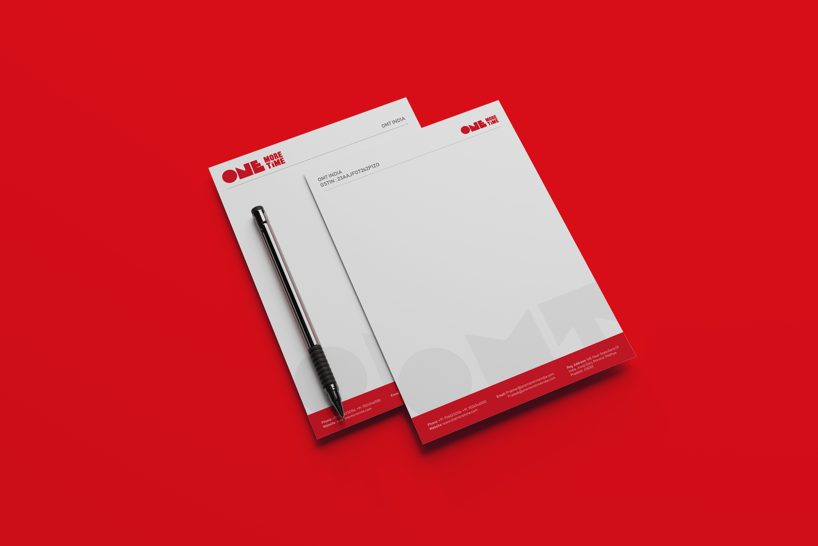
04 Letterhead Mockup

Recent Case Study